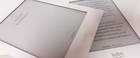
Screen quality sure seems to matter when we’re talking about smartphones and laptop computers, but when electronic ink screens in digital readers are already good for text, can a better display really make an eReader look better?
Currently at GadgetGuy, we’re reviewing two of the latest Kobo eReaders, and while we’ve yet to put a star rating on them, we were keen to see what differences the technology held between them.
With eBook readers now hitting the market for as low as $50 and digital books beginning to outpace their physical counterparts, the devices are becoming cost effective to everyone, but not every person likes the idea of an electronic book.
At the moment, an eReader can’t make up for the smell a book has, with that crisp scent that only bound and printed paper puts unable to be created by an eReader.
There’s also the feel: sure, eReaders can have quilted or slanted backs, and a lot of attention to detail can be paid to reducing the weight and thickness, but because these are made to be portable, they can’t really deal with the solid heft a real book presents.
Those are two issues readers often argue with us, things eBooks can’t solve, at least not yet.
The other one is the look of a book, the sharpness of the page, and while electronic ink screens look good from every angle and are better on the eyes than your traditional LCD, are they as good as a book?

Just like what we did with the Retina smartphone screens, we’ve taken an up close gander detailing one word and how it compares on a screen-to-screen basis.
Both devices are from the same brand – Kobo – but each has a different display resolution, with the left example grabbed from the Kobo Glo with its 1024×785 screen, while the right will represent the Kobo Aura HD with its 1440×1080 display.
First there’s the eBook screen without its front-lighting turned on.
This is the way most people view an eBook, and here you can see that there is a real difference up close. The Aura HD produces smoother lettering, but given the viewing distance and 6-7 inch sizes of eReaders, isn’t likely to be noticed by everyone.
With the front lighting switched on, that clarity the Aura HD offers is instantly more noticeable.
Both with and without the light, it’s easy to see why eReaders resemble paper, with an almost printed quality to the words and slightly patterned texture.
Interestingly, while the technology is better in the Aura HD, it’s still no match for a real book.
We’ve come pretty far, but a real book is still sharper, clearer, and better on the eyes. There’s no risk of pixelation here, and everything looks excellent.
You still can’t carry multiple books inside a real book – not in a useful way, anyway – but maybe when the screen technology is better again, say a few years from now, we’ll be at the point where an eReader is sharper than the printed book.
Now, to address that smell we keep missing so much…


